
Role: Lead UX Designer
UI/UX, Usability Testing, Accessibility, Content Strategy, QA Testing
App Tutorial


The Problem
The ZIBRIO BalanceCoach App had a very short MVP app tutorial that did not support users adequately.


Design Goal
Design a holistic and tailored tutorial experience that guides through the main app functions.
I wanted users to see how all the main features worked so that they had some background knowledge the next time they wanted to use each main feature.
The design would include:
Welcome Page
Instructions on how to set up their scale at home (connection via bluetooth)
Guide through a balance test (the main feature of the app)
Guide through the balance profile (second most important feature in the app)
Audience

BalanceCoach app users:
age range: 40-90
ranged from very comfortable to very uncomfortable with mobile apps/tech
tendency to not read the guides and manuals that come with the scale (medical product)
might own, use, or not own the scale (medical product)
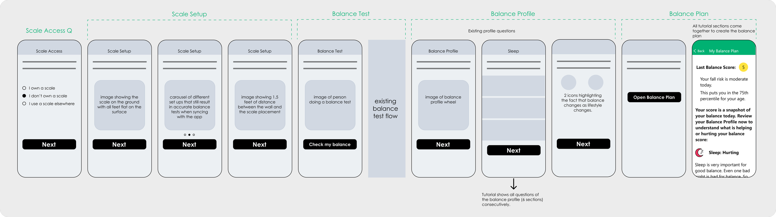
Structure

The diagram below shows the exact sections that I wanted to include in the tutorial. I suspected the tutorial would be longer than the average app tutorial because of the important instructions pertaining to the scale, which was necessary for the user’s success with the app.
Knowledge of our users
By this time, I had been working for ZIBRIO for 4 months and gained a lot of knowledge of the pain points and confusions surrounding the scale
1. Did not read product manuals and quick start guides
2. Did not understand the app’s value : balance health education and guidance


Wireframes
The wireframes indicate that this tutorial went beyond merely pointing out app features and providing brief explanations with tooltips. Instead, it guided users to actively engage with the features, leading to the creation of a balance plan (the final step).
Even if users skipped certain parts of the tutorial, they would still have a recollection of the correct sequence of events the next time they accessed the app to check their balance. This design approach was chosen because the primary objective of checking their balance and answering the balance profile questions was to instigate behavioral change, ultimately improving their balance health and overall well-being.
Without a clear structure and guidance for daily, weekly, or monthly actions, there would be a significant number of confused or completely inactive customers.


Design

Identifying different users

those who use a scale elsewhere
scale owners

solely app users
There was only a manual way of knowing which app users had purchased the scale and which hadn’t - and it was very difficult to know who had access to a scale through a care provider.
I designed a page in the tutorial that asked users if they had purchased the scale or used the scale elsewhere, like a doctor’s office.
This way, the team could group users for marketing purposes of:
promoting the value of the scale to non-owners
balance test tips to scale owners
new app features available for all app users

Tailored to User: If the user selected “I don’t own a Stability scale” or “I use a scale elsewhere”, the tutorial would automatically skip the scale education portion because it did not apply to them. They were also given a way to learn more about the product.
Instructions to set up the scale
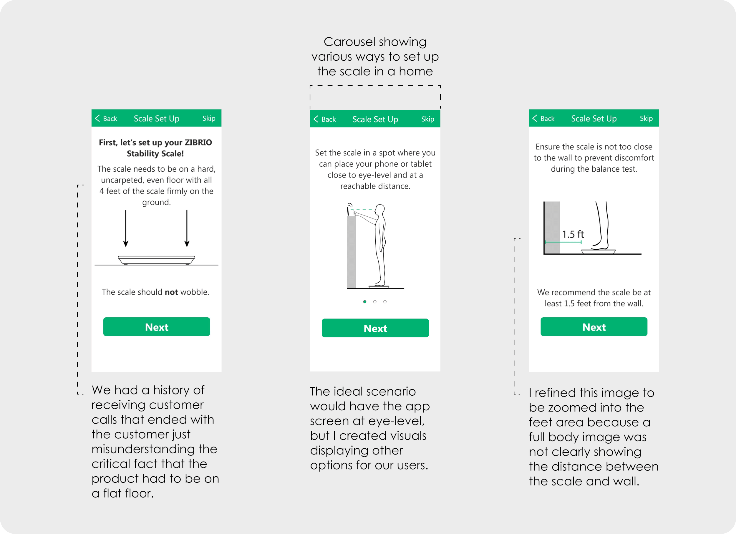
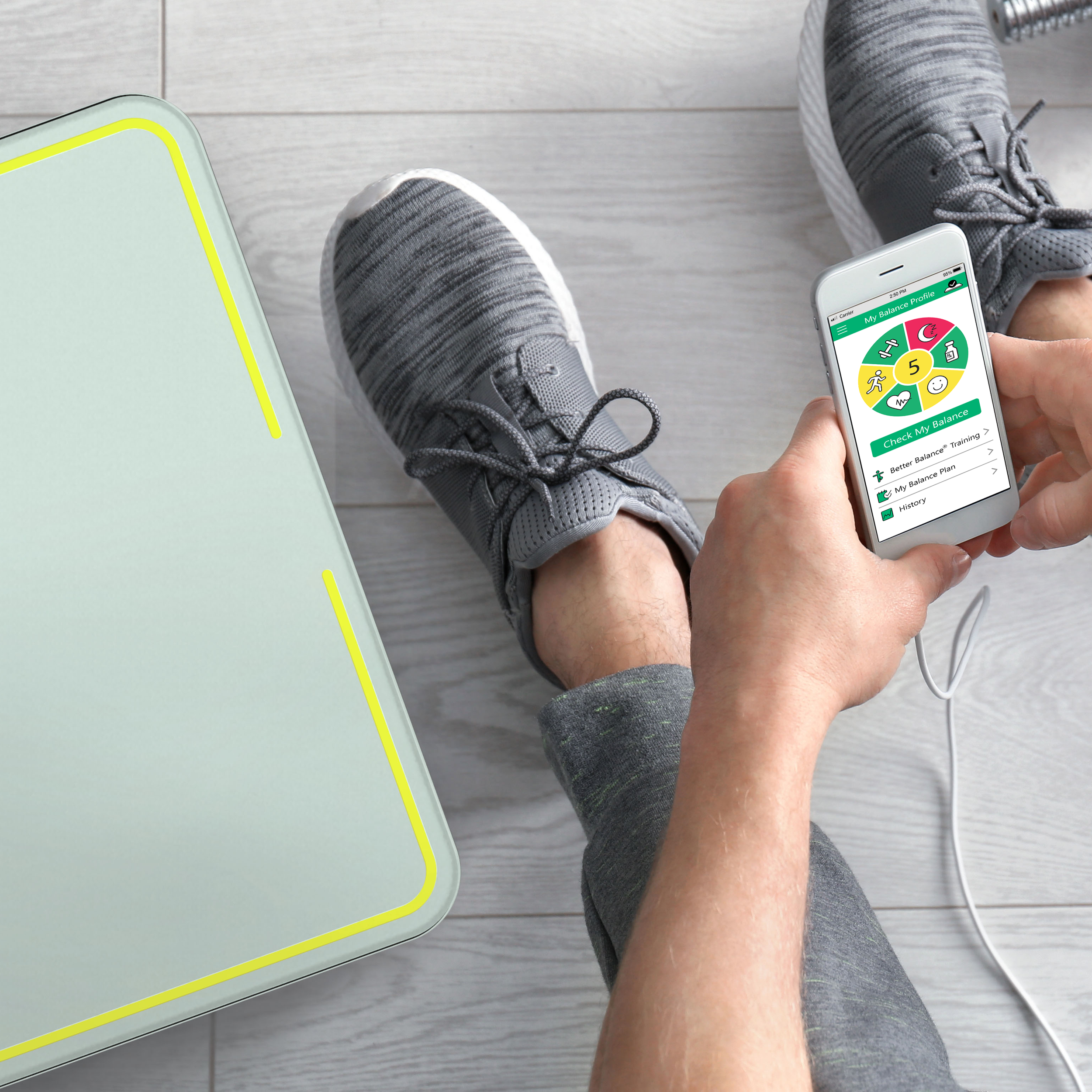
The app was designed to enhance the experience of the balance test on the scale by providing the instructions and a test countdown (amongst other educational features). The problem was that the app provided no help on setting up the scale in the best manner for the combined app use. The new design provided critical information to successfully use the highly sensitive medical product with the companion app. It was important to give the information in a concise manner and include visuals - which I had to design for this entirely new set of content.
User Testing

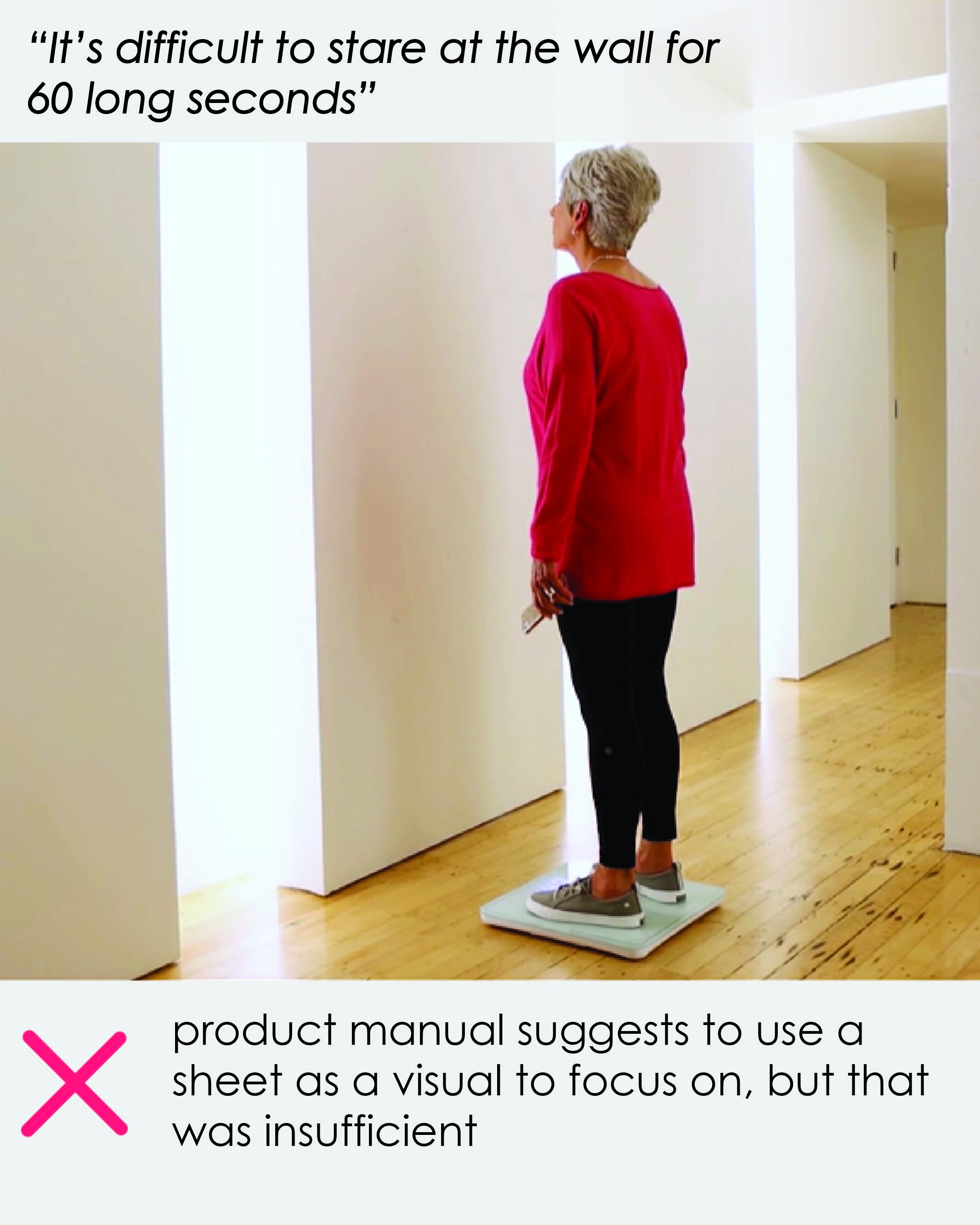
“If you move all the text above the carousel, it would be easier to read.”
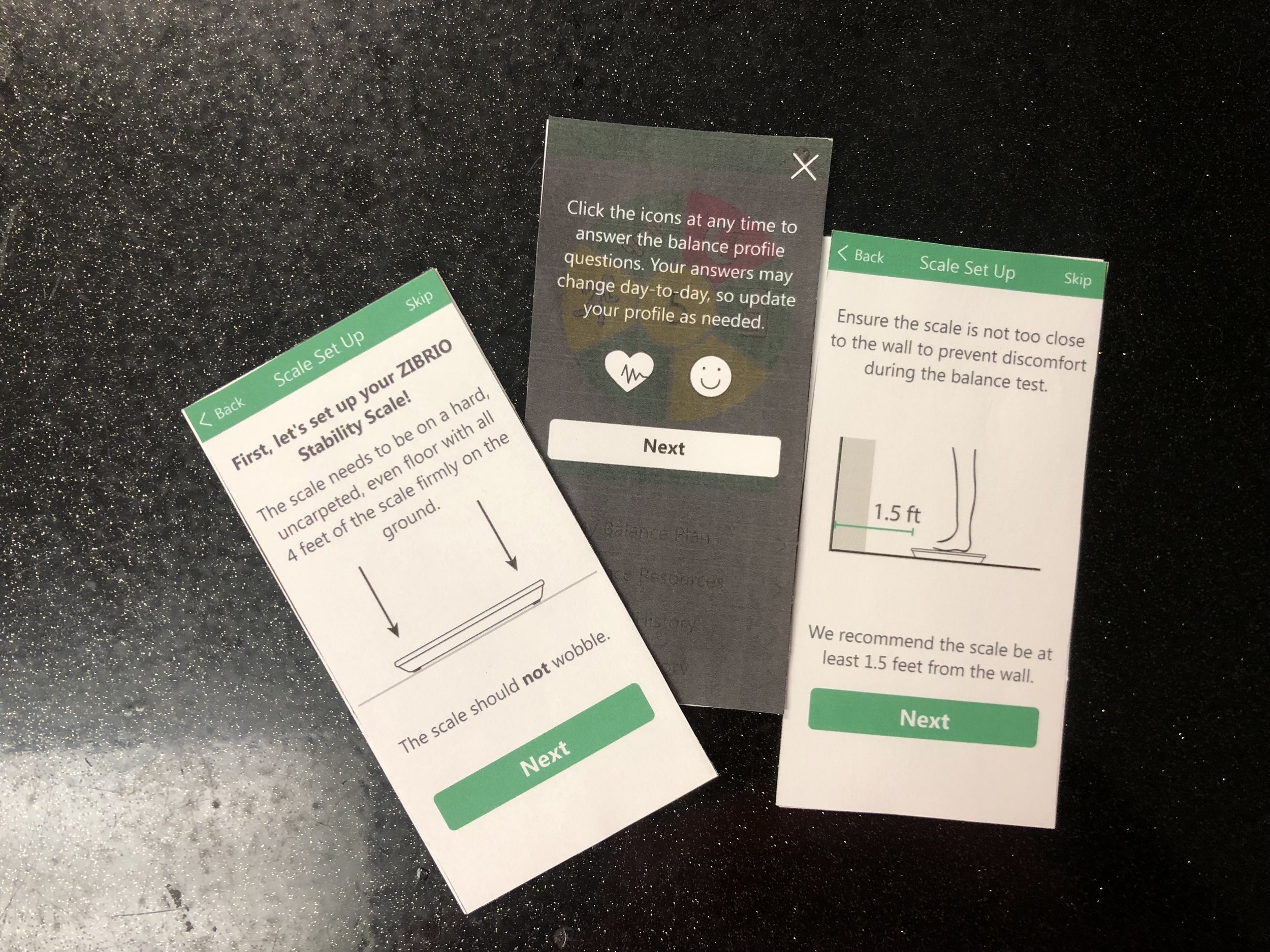
I printed and glued the frames on index cards so I could test the tutorial quickly in person. I also used my previous experience of testing the balance of 500+ seniors to inform my decisions on what needed to be explained more thoroughly.
Findings:
Unclear Arrangement - The arrangement of the content in the frames needed to change to provide clarity.
Too Wordy - The UX copy of the frames could be reduced to improve clarity.
Unclear Example Given - One of the educational pages included an example that was not intuitive or obvious for the user to understand.
Unclear Setup Graphics - The side view carousel of ways to setup the scale and phone were used thin vector forms that were not super clear. A 3D view of the setup would make the graphics extra clear.
Refinement

Lottie Animation & Final Welcome Page Design

The app had no animations at all, so I figured the best place to start adding animations would be the welcome page as it gave the 1st impression of the app.
I had previous design variations but they were all static and I wanted to give “life” to the logo icon that personified a balance coach.
Understanding the User

The Balance Profile feature page highlighted the MOOD and MEDICAL CONDITIONS icons as examples of factors that affect balance, but those examples where not super intuitive for people when they think about what affects balance.
The new design on the left hightlights the icons for SLEEP and EXERCISE. These 2 lifestyle aspects did come to mind when you ask someone - “What do you think affects balance?”
As a result of this design change, more users would understand the importance of updating their lifestyle answers in the balance profile feature. Updating their answers was necessary because life aspects change, which means their ability to balance can also change.
Balance Plan - the final tutorial section

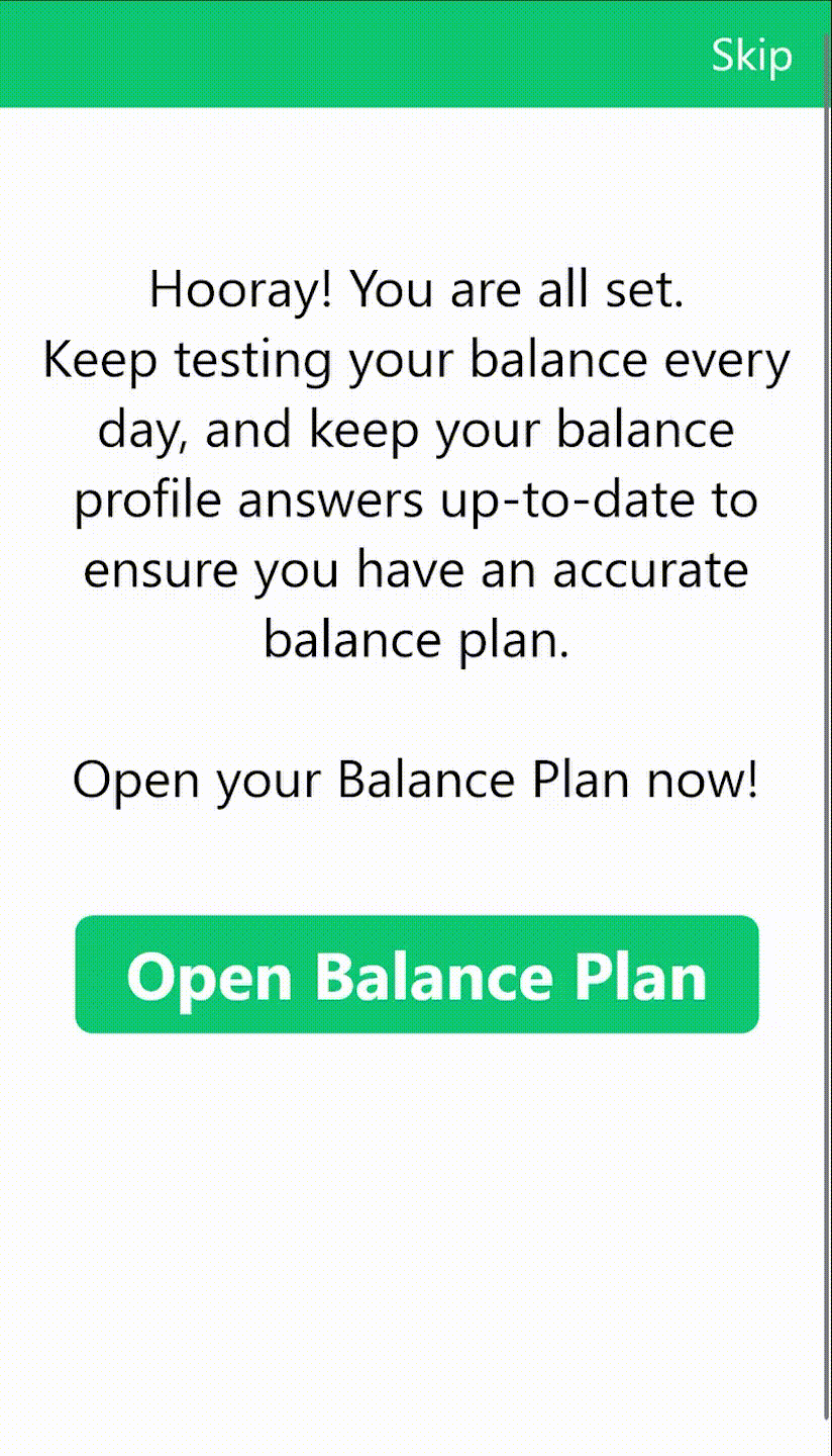
The final section of the new tutorial directed users to read their balance plan advice based on the score they received from the balance test embedded in the tutorial in combination with the answered they selected within the balance profile feature. This showed the user what the score meant within the context of how their lifestyle was helping or hurting their balance to result in that score.
The balance plan was the grand finale where all their tutorial activities united to create the big picture for them. That is why I designed a page that prepped the user before they saw their balance plan.
The setup graphics in perspective and color helped users distinguish what each object represented. They also helped give context of possible rooms to put the scale in.
Refined Graphics for Setup Variation


Final Design
BalanceCoach App Tutorial
The new app tutorial explains the relationship between the app and the scale and walks the user through all the main app features with the use of clear and helpful visuals.

Better Balance, Better Life
Figma Prototype

Business Impact
We released the tutorial in Jan 2023.
I am constantly learning from our users and improving the tutorial and overall app!

better customer experience

improved handle on marketing efforts, resulting in sales