


Exhibit of medical device through the use of companion app
Role: Product Manager
UI/UX, Visual Design, Unmoderated and moderated usability testing, Printed materials, Implementation, and Customer Success
The Opportunity
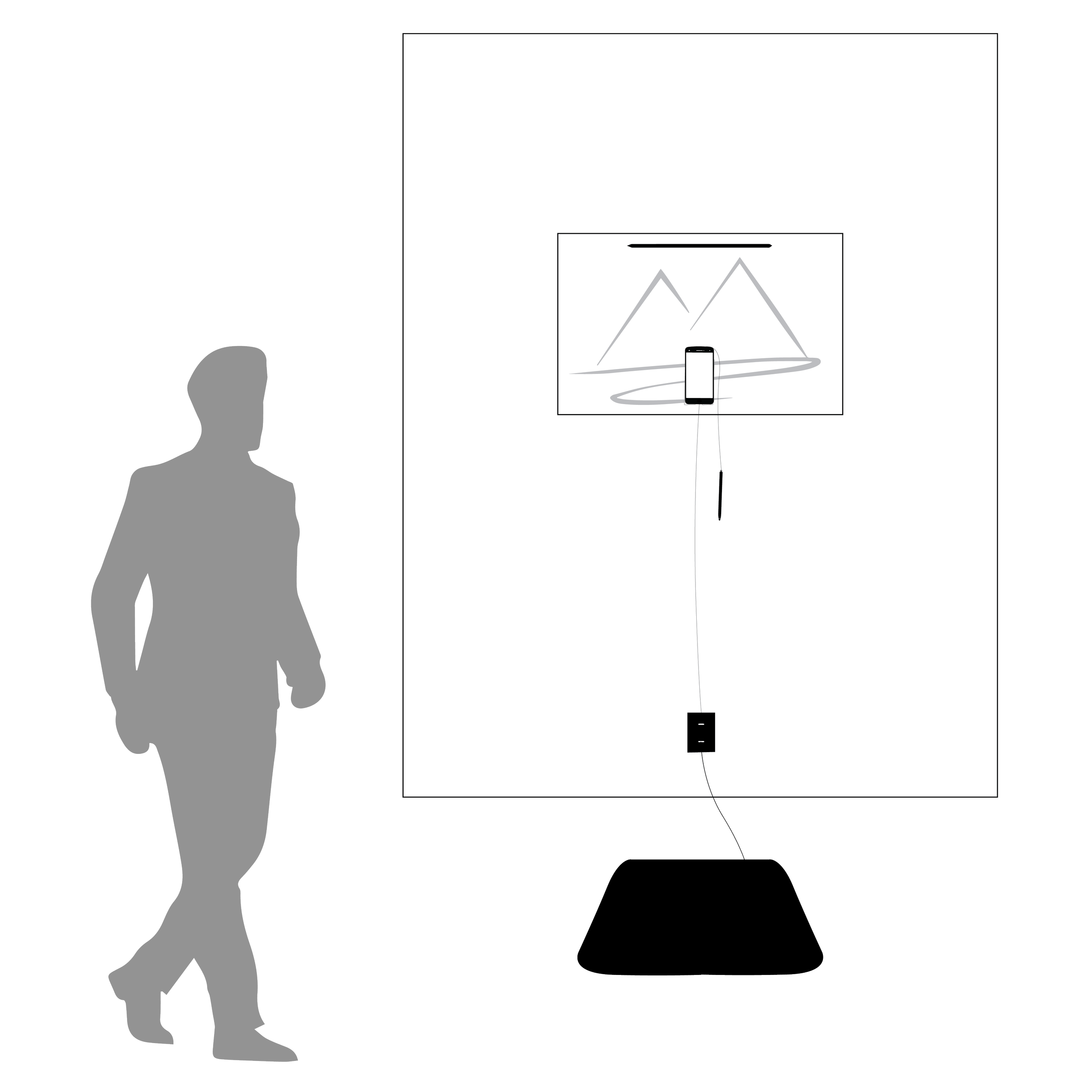
The portable nature of the Stability Pro scale (medical device shown in image) provided an exciting opportunity to showcase its cutting-edge technology in live demonstrations without the constraints of supervisor presence. By offering the scale for rental, healthcare professionals and institutions can harness its prowess for live demonstrations, educational events, and training sessions.

Stability Pro scale - medical device that measures balance and fall risk when a user stands on it for a 60 second balance test.
Design Goal
Design a product showcase experience that markets the Stability Pro scale and its applications.
Requirement: should not require supervision
Location: innovation centers, tradeshows, senior living centers, construction company innovation rooms
Value: The Stability Pro scale allows users to test their balance (postural stability) and receive a balance score from 1 to 10 with a simple 60 seconds standing test.
Eye-Catching
Easy to Use
Informative
Visitor Journey Map
How can I get people passing by to actually stop and try the product?
I needed visual indicators, so I started with a journey map of what the experience would be like.
Awareness
Someone passes by and notices the exhibit and the poster instructions.

User decides if they will interact with the exhibit.
Steps on the scale
User starts to read instruction on app
User steps onto scale

existing app design
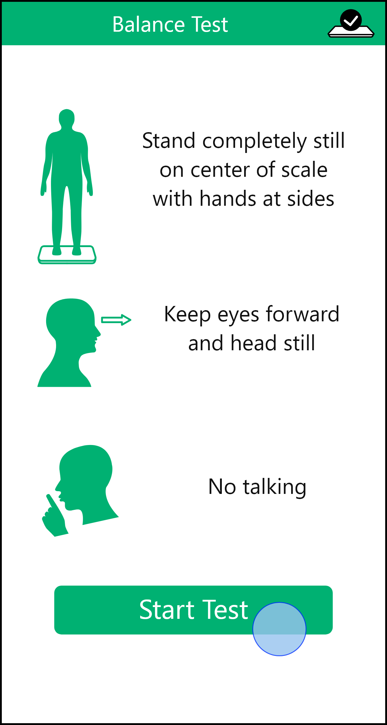
Balance Test
User Hits “Start Test”
User stands still for 60 second balance test (focuses on poster)
concept

Receives Score
User reads score given by the app
User proceeds to see final page in the flow which provides a way to learn more about balance

existing app design
concept

Visits Landing Page
User learn more about balance and the applications of the product
User can enter sales funnel
User leaves the exhibit
Exhibit is now ready for the next user

App Flow

The main screens were finished but I realized that I really had to step back and forget everything I knew about the product. Each step had to be clear to the user in order for the exhibit to be usable.
Prominent Indicator
The visible page featured a prominent blue arrow instructing people to step onto the scale, aiming to capture their attention and encourage interaction with the product/exhibit.
Test Countdown
A visual 60-second timer to ensure users were aware of their remaining test time and also served as a focal point during the test.
Email Entry
If users were interested in learning more about the product, their score and education information could be conveniently sent directly to their email
User Testing

“It would be great if it was easier to touch the phone.”
Findings:
Brand Disconnect: The experience was not bringing the user full circle to understand the value of the product with the company name and offerings.
Friction at Email Entry: Delivering information to the user via a self-entered email was not a clean option as users were not willing to spend another 5 minutes to enter their email, all while the phone was attached to a wall.
Interrupted Flow: The app flow had to account for visitors leaving the exhibit before the last “official” page of the entire flow. If a visitor left before seeing the final page of the flow, the design needed to recognize this and accomodate by returning to the first page.
Touch-Point Difficulty - In order for the visitor to take the balance test, the visitor had to physically hit the “Start Test” button within the app but it was a bit unnatural for some users since the phone was positioned with the ideal distance of 1.5 ft from the scale to prevent dizziness. The phone was still at an arms length, but the current experience had room for improvement.
A more traditional approach to the exhibit - with take home flyers - removed the friction we observed during the initial testing.

This resulted in:

Shorter experience for the visitor

A more delightly experience - free of burden

Increased rate of visitor per hour
Design Process continued
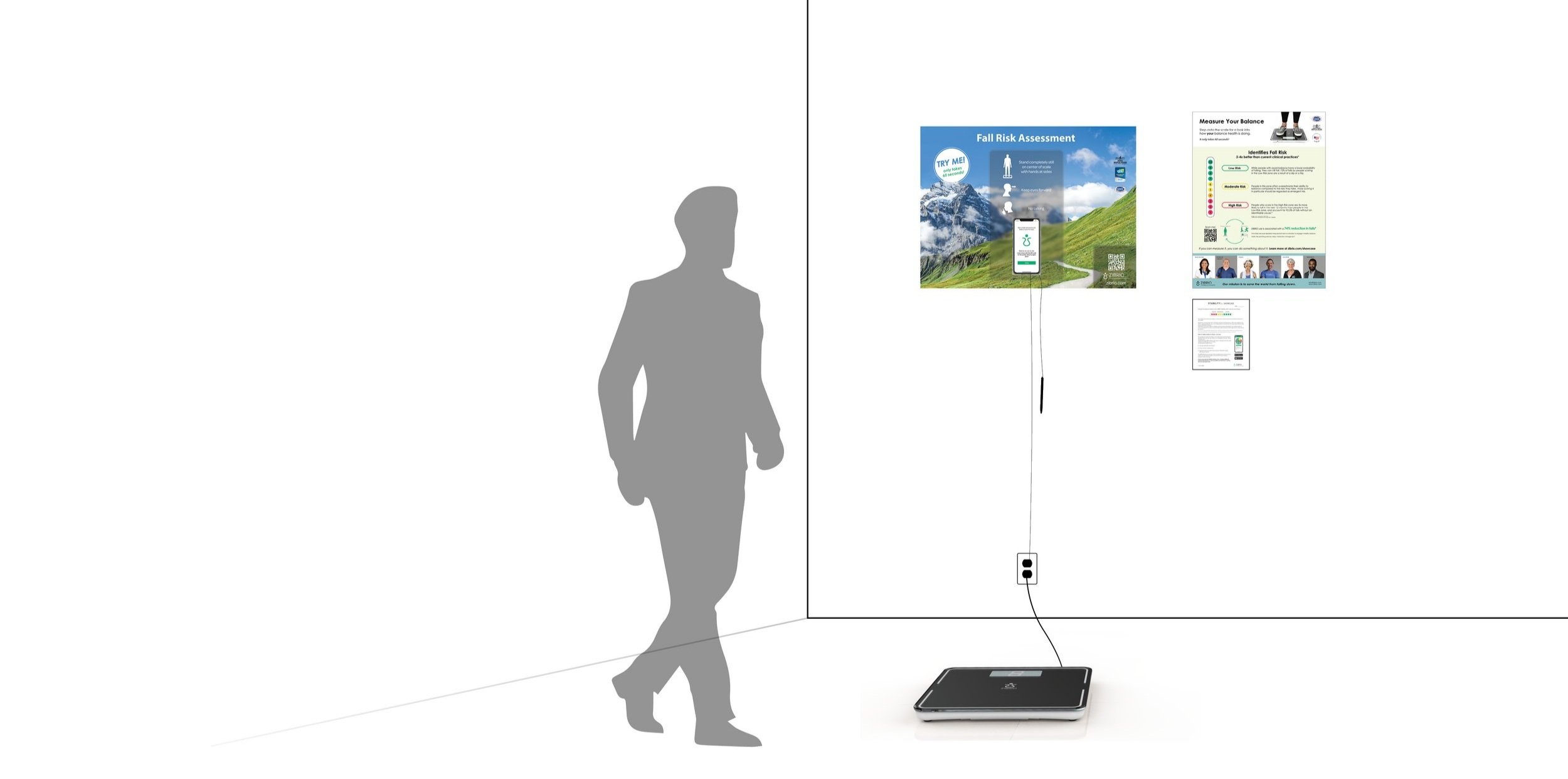
Based on my findings, I created 2 new materials. These materials are placed next to the main poster of the exhibit.
Explanation poster - content that user can quickly look at after finishing the balance test
Post Test Sheet - educational take-home sheet for the user
Explanation Poster

Users would not see the value in the product if they didn’t understand the output of the product - a balance score. I designed the poster with these questions in mind:
WHAT DOES THIS SCORE MEAN?
WHY SHOULD I CARE?
Why did I design it this way?
The majority of people are surprised by their score, as it is usually lower than they would predict. Most older adults have a higher risk of falling than they would think. The poster is part of the critical educational component that surrounds this particular product, one that offers something no other product had before, a quantifiable way to understand balance.
Post-Test Sheet

Although the explanation poster provided information about the score and how the product can be used to reduce falls, it was important to provide something for the visitors to take with them. This way, the visitors could easily revisit the information or share it with others in a tangible form.

new exhibit layout
User Testing
5 testing sessions

The testing sessions brought up a critical point.
The Exhibit Lacked Visual Pull - While 80% of people walking by slowed down to read the title or look down at the scale, only 35% made a complete stop to engage with the exhibit. Additionally, the first page of the app experience didn’t work with the main Mountain poster messaging at all and therefore contributed to the low engagement.
As the testing went on, I tried different visual tactics to see what worked best.
“Movement and bigger text can attract more people to measure their balance.”
Refinement
I designed this animation for the first page of the flow. It is a group of blue arrows that intrigued the passer-byer to step onto the scale before anything else. It was big on the phone screen - caught people’s attention. Although it was a simple change, it worked very well and matched the blue of the sky image on the poster. The arrow visual could be noticed from 10 feet away!
Lottie Animation

I also added a “TRY ME” circle graphic on the main poster since it triggered human curiosity, similar to pressing a button for a toy to make sound.
Graphic Element

“Final” Design
The showcase promotes the product applications by first making the experience personal through a balance test. Then it continues on to educate the visitor about the severity of the fall risk problem that ZIBRIO is addressing, and how they can apply it to their personal life or business.
Stability Pro Showcase

Business Impact
Increased Awareness
50
balance tests per day in just 1 facility
More Customers
300%
increase in orders
showcase across the nation
Nationwide Exhibit


This project continues to evolve, as we were requested a full wall exhibit!
This exhibit is currently implemented in senior living centers and in multiple Construction and Maintenance companies as an awareness and safety tool for their employees.
Product Manager, Delivery, and Customer Experience
I managed this project from the moment it was handed over to me, which is why I had to wear many hats - and I really enjoyed it!
I handled all phases of the product. This included the product description and price sheet, creating the instruction materials, and packing up each bundle myself.
Each customer received a kit that could be quickly and easily assembled to make the product showcase. The kit included:
Setup Instructions Booklet and Quick Start Guide
Smartphone with companion app pre-downloaded
Large Stylus for easy interaction with smartphone
Showcase Poster
Stability Pro Scale ( medical device being showcased )
Educational materials


I designed an 11 by 17 folded, 1- page booklet with instructions on setting up the showcase and how to use it. It included imagery at every step to help the customer understand how all the pieces came together to create the showcase experience.
Instruction Booklet
Each order is packed by me, with all the bundle items, and small touches of my own, like a sticker notifying the customer that there is paper material between the cardboard. I also log into their app account beforehand, so that when the package is opened, the customer has 1 less thing to do.
Packing Orders

As the lead of the Customer Experience, I oversee every aspect of the rental process, from the moment the product ships out to the final return and balance data review. One of the most fulfilling aspects of this project has been gathering feedback from our customers and visitors on the showcase. The following are some of the comments we have received.
Customer Experience
“We have peers in the industry very interested in having their own showcase and analyzing the balance data of their workforce to improve their workplace.”
“Instructions were super easy to follow. And amazing touches for the phone to already have us logged in.”
“I test myself everyday that I come into the office!”