

Fertility Care Ecosystem Onboarding: Physician, Patient, and Experts

Role: Product Designer
Customer Analysis, User Research, Branding, UI/UX, Concept Design, Service Design, Prototyping
The Need

A femtech client wanted to create an ecosystem of digital products that provided data-driven and integrative care to accompany the IVF fertility treatment. The company partnered with physicians to provide custom fertility care licenses for the patients.
The fertility license is activated within a mobile app for the patient, while the physician-facing platform monitored the patient remotely, throughout the duration of the care period. The patients can also connect with various fertility experts to get further support.
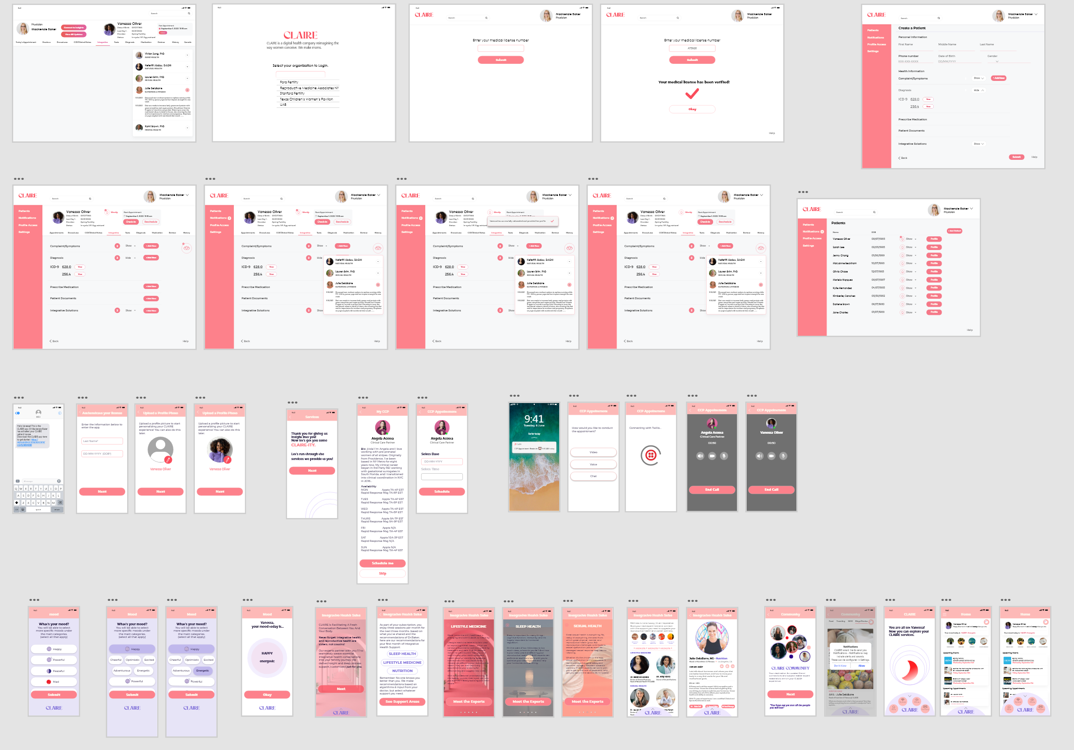
Mobile App Concept
Onboarding
Health Suite Services
Access to Health Experts
Physician Platform Concept
First-time Physician Verification
Adding a Patient
Patient Profile
The IVF experience

35%
success rate
in first IVF cycle despite being performed in the US for 40+ years

91%
sought alternatives
of women report using Complementary and Alternative Medicine (CAM) methods to improve fertility treatment outcomes

87%
were overwhelmed
during their IVF journey because of all the platforms or resources they were managing at once
Understanding Users


Design Goal

Design a trifecta of fertility support - connecting the patient, the physician, and experts
Seamless Connection between professional and public users
Personalized Experience for the patient
Sense of a Support Community without overwhelming the user
Patient-Physician Journey Map
Based on my previous experience creating a patient app and physician platform ecosystem, I started by mapping out the onboarding process.

Brand Direction
The company brand guide consisted of words and images that explained the mission. Because the mission was to help with fertility, it was very important to have sophisticated and empathetic language, while also being aware of the sensitivity around the various fertility journeys.


Design Approach
Since the client had a very specific vision of what they needed for their fundraising purposes, I hit the ground running by prototyping and refining through more prototyping.
This way I could steer the client towards a more neutral color scheme - but also get the community feedback more efficiently.

I had a focus group of 10 women, and a group of physician and fertility experts to work with as I created the design and visuals.
Design Process continued
The original idea of the mood question was thought of as the “vibe tracker”. (client’s proposal)
With my knowledge of the vast number of femtech startups currently in the market, I made the decision to steer away from sounding like a sextech company and used “mood” to keep everything clear for the users.
Patient Onboarding Icebreaker
It was important to include specific mood subsections under each main mood type. If the app only had 5 mood choices, it would be a disservice to the patients.
Emotionally Understanding the Patient

Client inspiration

My design direction

“The more clarity we have, the better. We are navigating a busy life and IVF can take over a huge chunk of it.”
- Focus Group Member
How could I create a sense of community but not overwhelm?
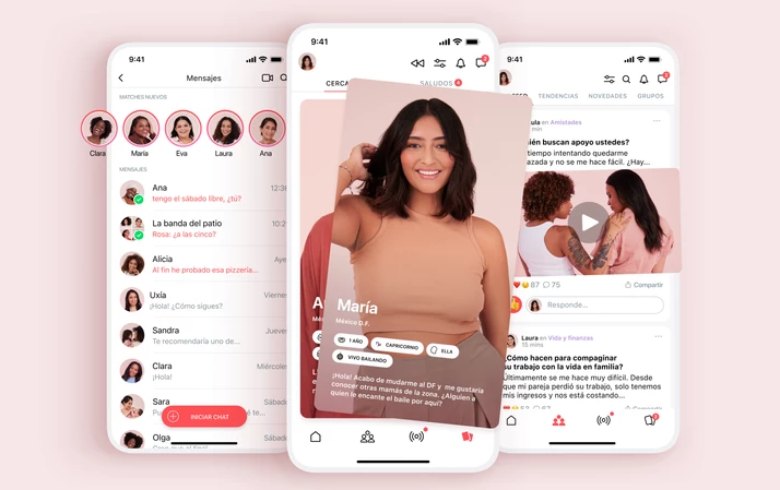

Market Example: The Peanut app has a space for women in the fertility journey to meet and connect - but it was an unlimited amount of discussion and it led to negative experiences with the users being judged or attacked by others
of women preferred to completely separate their care from social support
87%

That led me to focus on an ACTION community.
com·mu·ni·ty : a unified body of individuals
UI and Visual Elements
I chose purple shades for the primary colors because purple is more neutral than the colors from the client’s mock-up. The purple shades were a better fit for both the physician platform and mobile app as it kept the products looking professional but also set the products apart from the bland look of standard medical software.
Colors
Physician software


#8D84C2
#D7D4EA
#707070
#000000

#FDF7ED
Mobile App


#ED1E2A
Neutrals
Primary
Font Color
Font Color
Primary
#FDF7ED
#7E6ED8
#C5BBFF
Accent Color
Typography


Icons
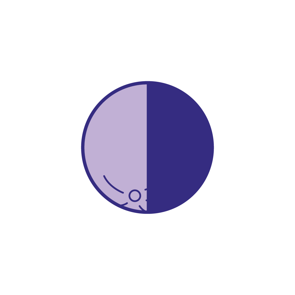
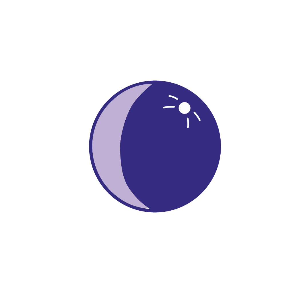
I drew inspiration from the company’s moon logo to design the mood icons used in the mobile app.
It gave the moods an anstract feel and helped users see the moods as phases - not as part of their identity.
Mood Icons

Happy
Powerful

Peaceful

Mad

Sad
Scared
Final Design

The entire process begins with adding physicians to the FAIRE physician software they would use with their fertility care patients. Each practices’ physicians used their medical license number for verification. The verification of each physician was crucial for the protection of PHI.
Step 1: Physician Verification

The physician creates a patient and activates their FAIRE license/prescription.
The prescription gives them access to the mobile app services provided by FAIRE, including access to a variety of fertility experts, and a record of their fertility care.
Step 2: Physician creates Patient
Once the physician adds a patient, a text is sent to the patient so they can complete the onboarding process.
Meanwhile, the physician can move on to Step 3 and select who else has access to the patient profile.
Physician Digital Experience
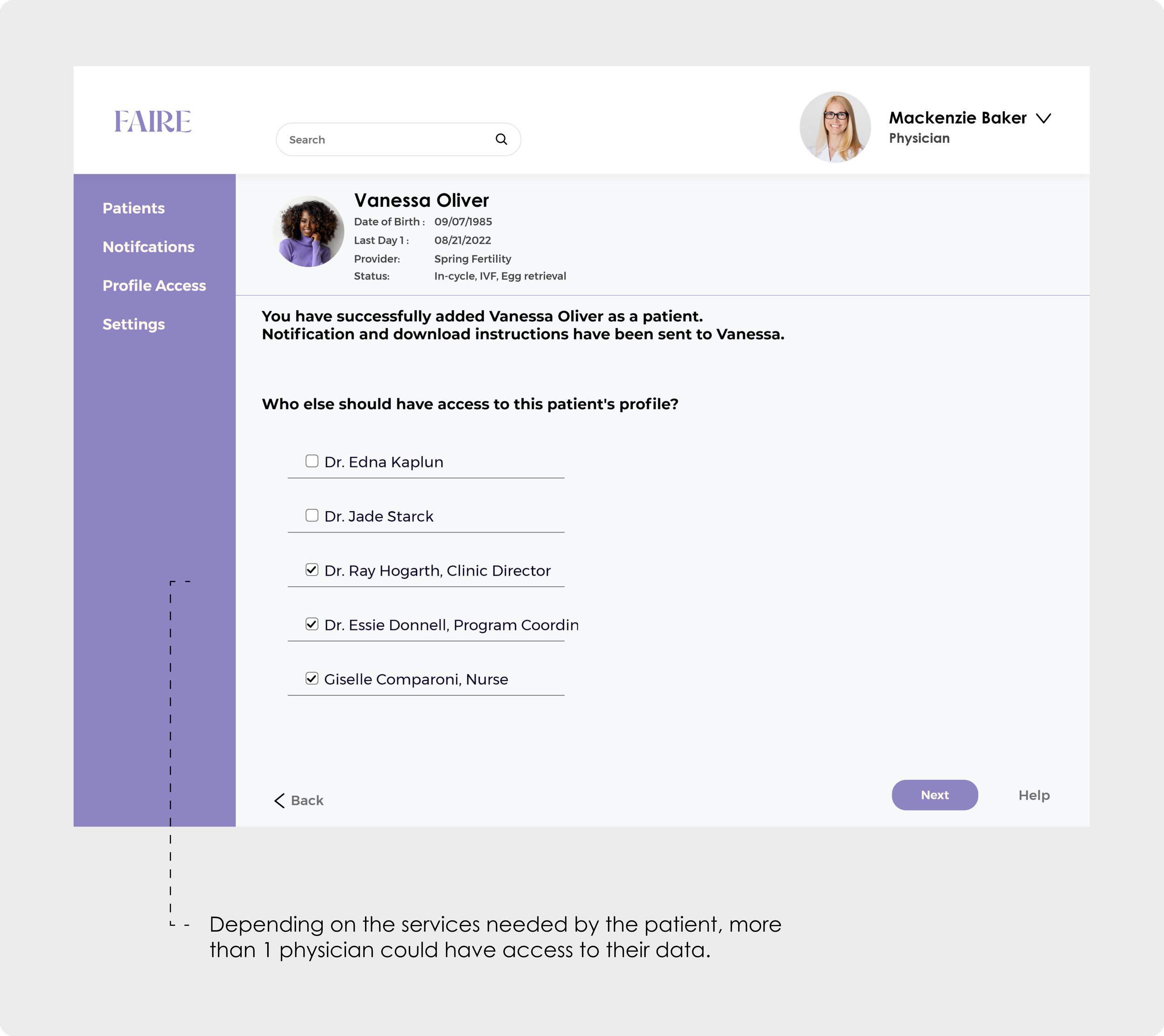
Patient Digital Experience

triggered text to patient
“CLARITY NOW LOADING”
…signifies that the physician has completed the process of adding a patient. Now the patient must complete the onboarding process to use the services.
At the time of patient creation, the patient is designated a Care Partner, which are provided by FAIRE. The Care Partner is their point of contact through the app - someone they can contact at any time.
Physician Digital Experience

Patient Digital Experience
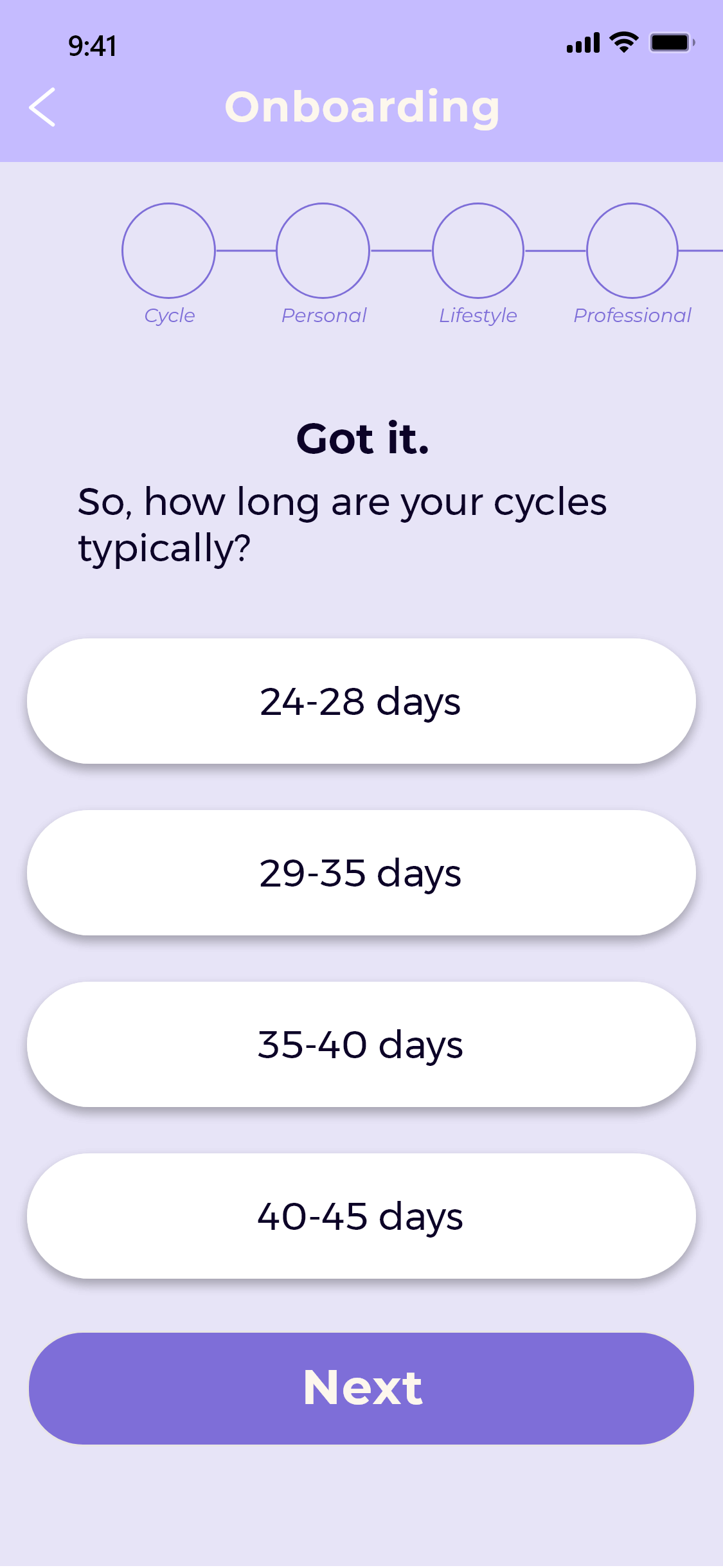
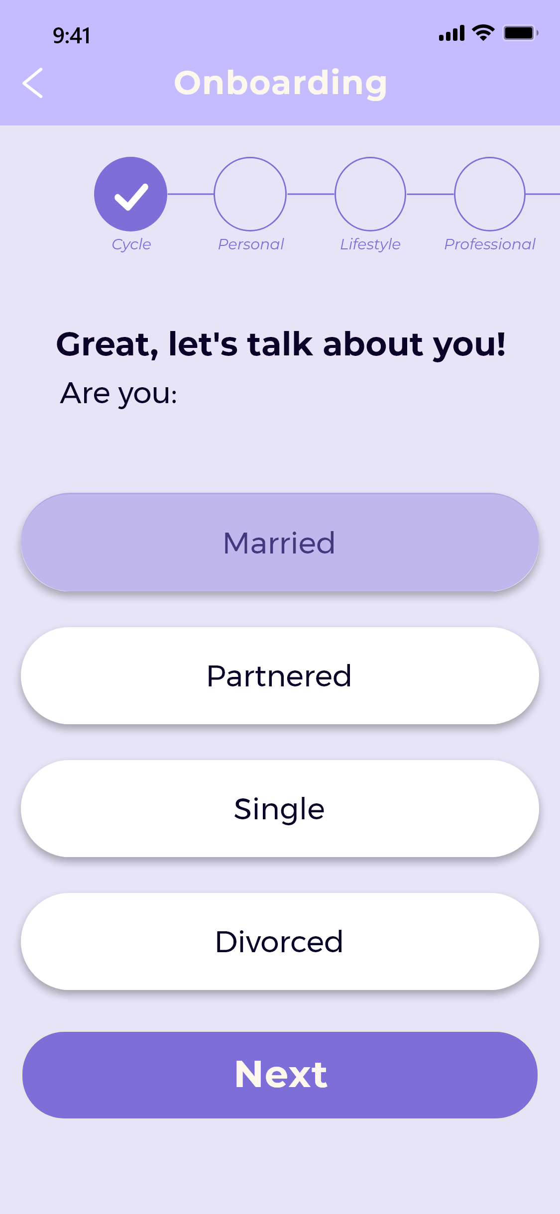
Patient continues onboarding within the mobile app

The onboarding process is a set of questions that touched various life aspects of the user:
Today’s Mood, Menstruation Cycle, Personal, Lifestyle, Professional, Family, and Home
The user’s answers are saved so that all healthcare professionals better understand the user and provide personalized care.
Patient Onboarding


Crucial Features
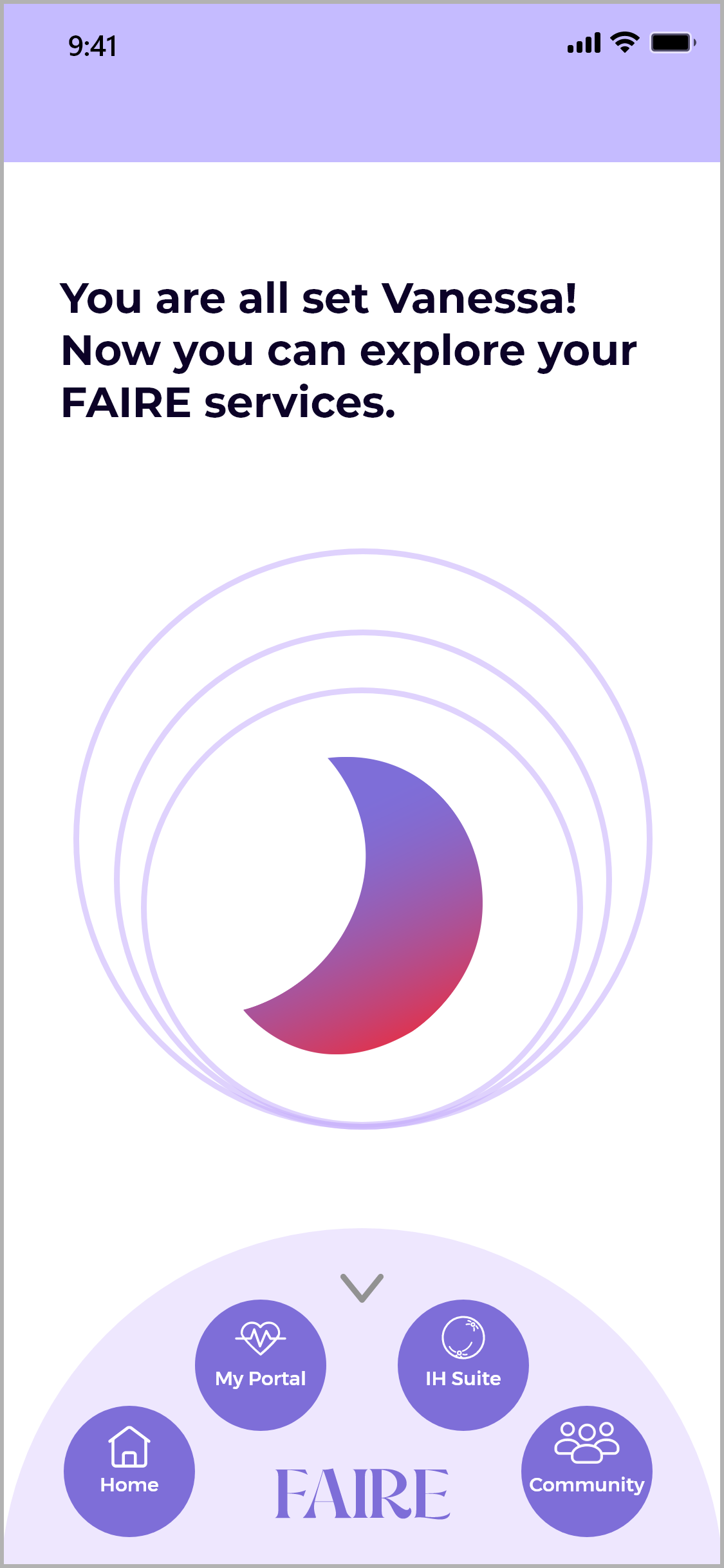
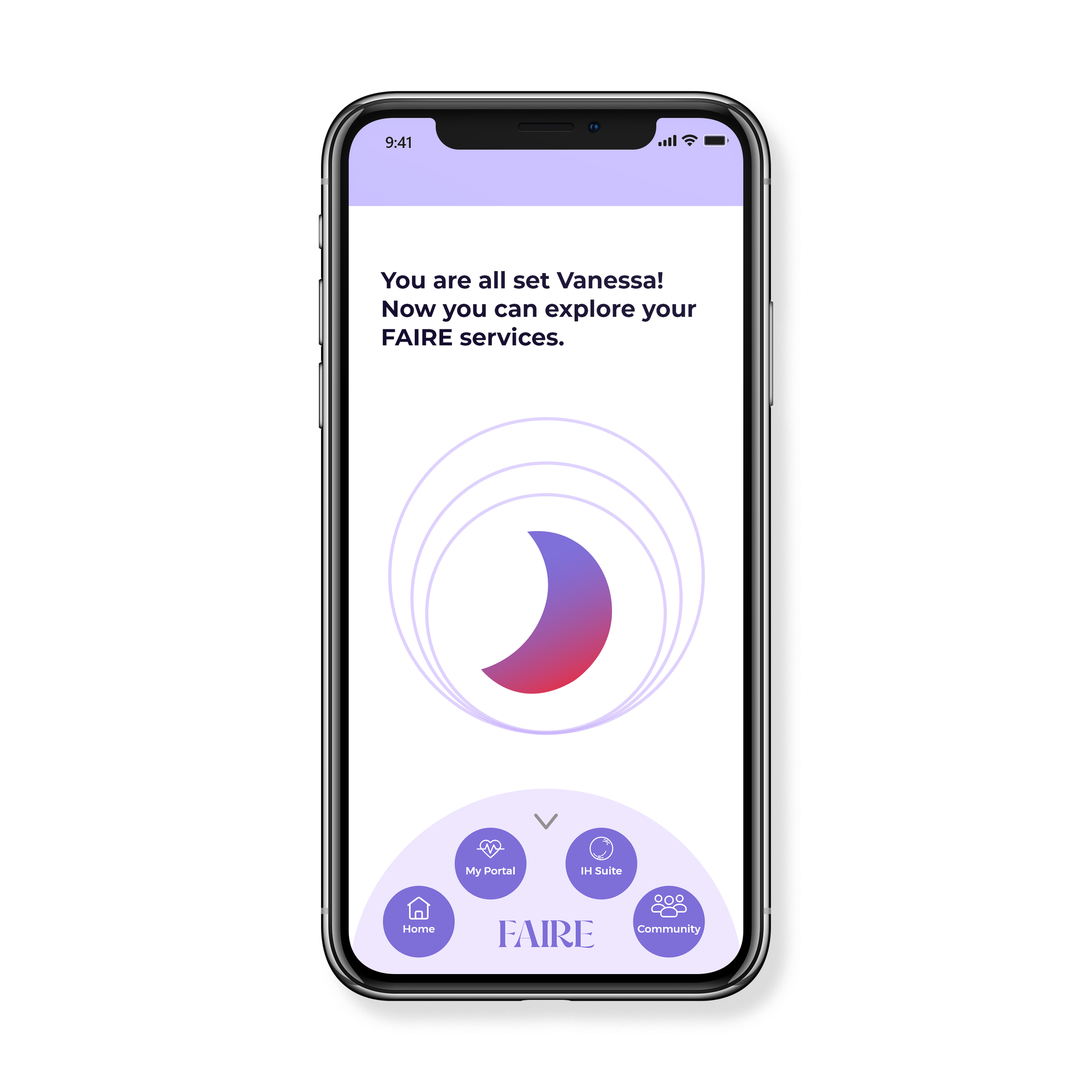
After the onboarding questions, the user was “released” to explore the features in the app.
There are 3 features that come together to create the bigger picture - their fertility health journey.
My Portal

Health Suite

Community

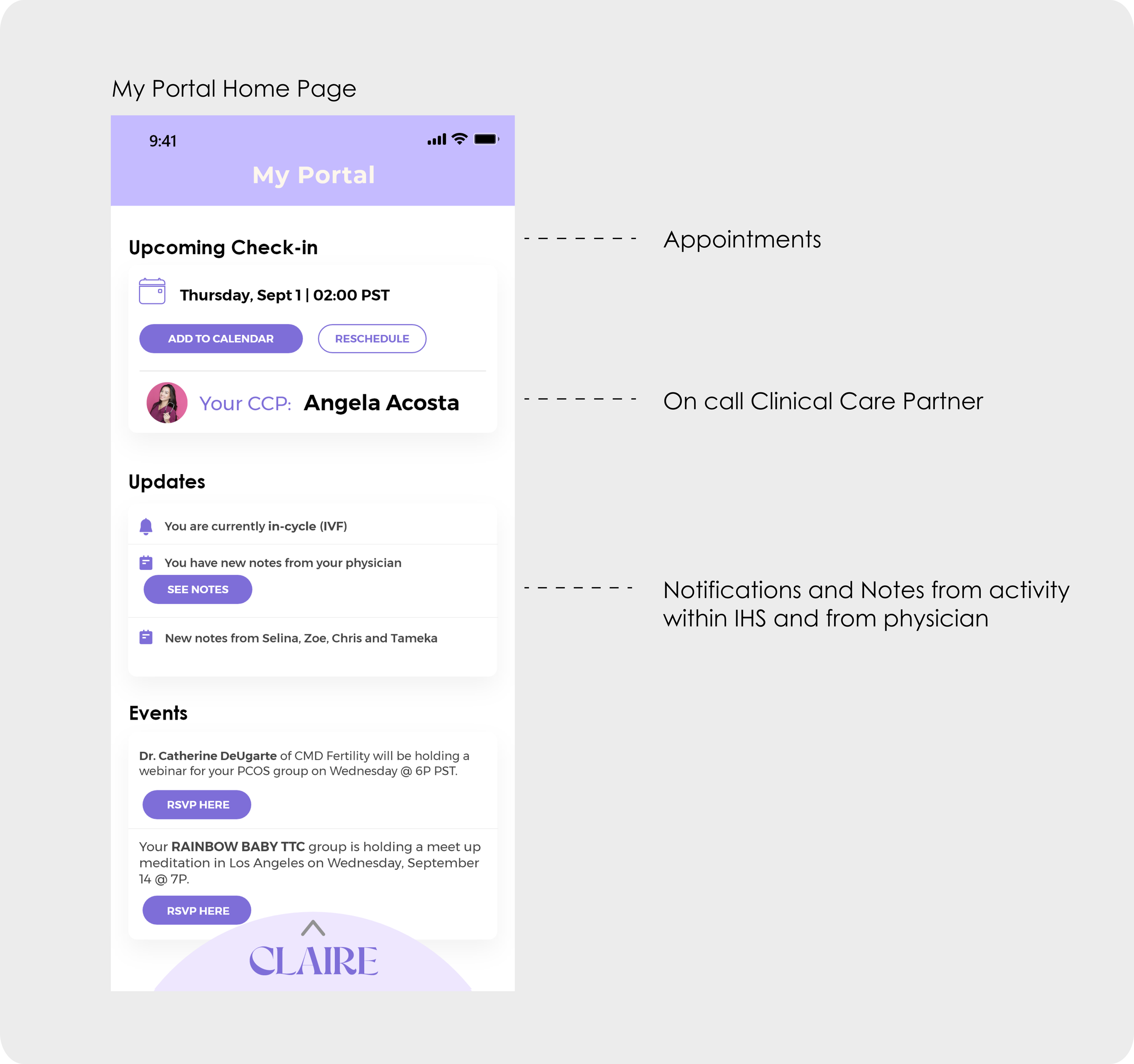
My Portal
“My Portal” includes the patient’s medical information, appointments, and activity within the Integrative Health Suite.
The physician and specialists have access to this data.
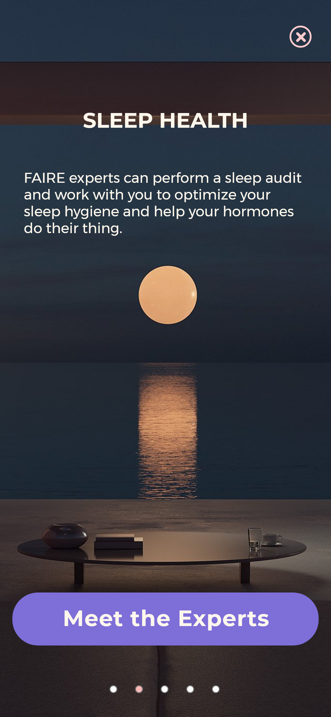
Health Suite
The Health Suite provided an introduction of the different health areas the user could receive expert assistance in.

Introduction Flow


After the introduction, users enter the Integrative Health Suite.
Users can look for experts by selecting a specific topic, or they can look scroll through the list of recommended experts within each topic.
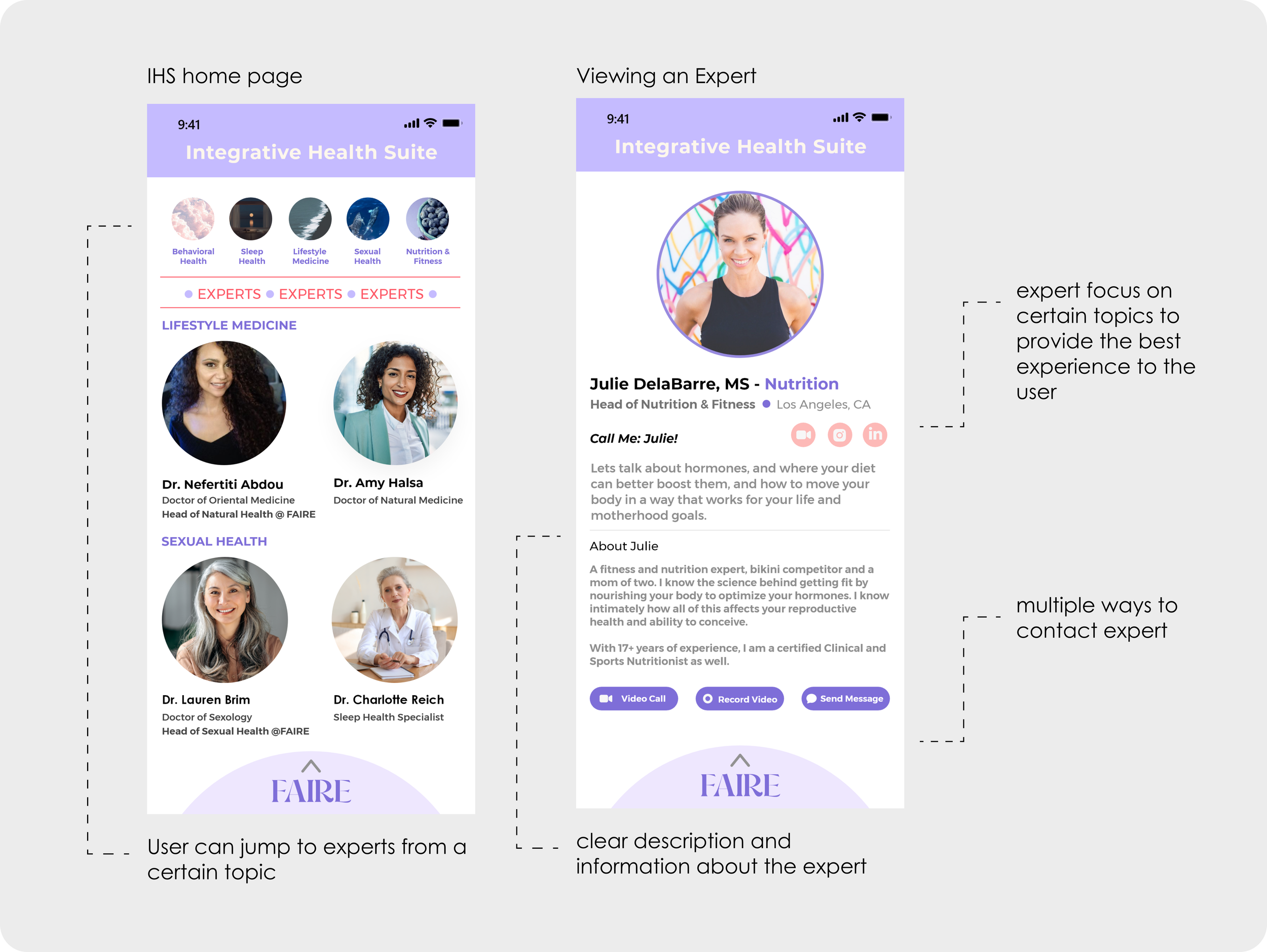
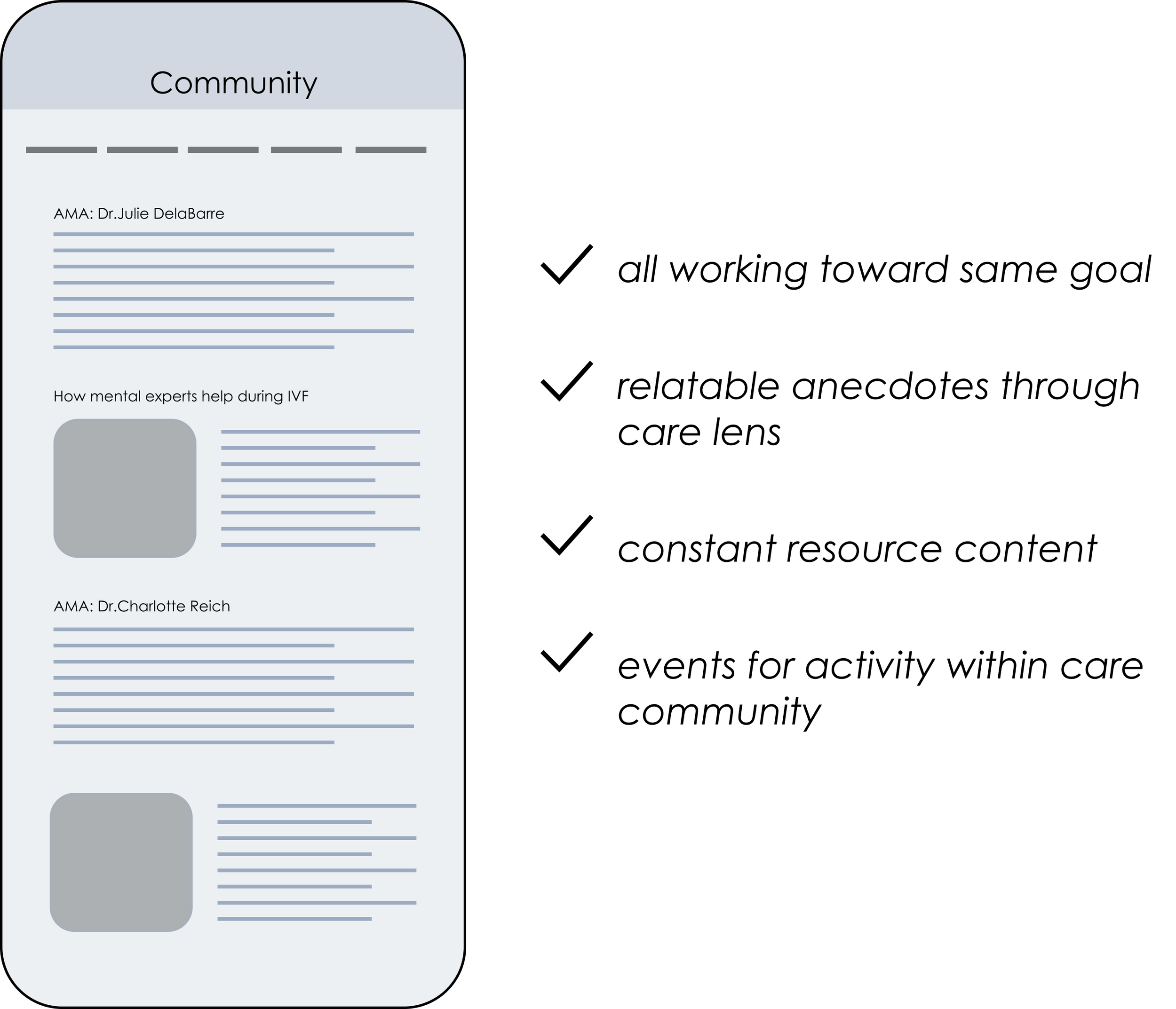
Curated Community

The “Community” feature provides useful and curated resources, anecdotes, and the opportunity to chat with experts based on the user’s interests or needs. It did not connect patients.
I designed it this way because it offered a safer experience for the users. A community of caregivers and experts would always bring a positive light to the users.


Business Impact
FAIRE is currently using the new branding and digital service vision to update it’s website and close its 2MM funding round.
A picture is worth a thousand words and an MVP prototype is incredibly helpful to convey a digital business.