
Advertisement Creative
Role: Graphic Designer
Creative for targeted marketing campaigns on web, social media and print
“You can identify more patients”
Goal: Design creative for a Linkedin and Programmatic Digital Ad campaign
Audience: healthcare practitioners
Message: The value of the product in the practitioner’s eyes - Identifying fall risks more accurately can help prevent falls and reduce costs of falls.
Outcome: A vibrant high-impressions Linkedin Ad campaign.
236,595 impressions in 10 days
We knew we wanted to stand out on Linkedin so I chose a bold turquoise. The task at hand was to get their attention with the least number of words. At first there was too much going on, so I refined down to just 1 statistic.
Process:


The final design was a carousel, as it allowed us to tell the story of the product’s value over 3 cards.
It showed
The problem in a question format
The value of the product
What that value meant to them
Final Campaign


Since the other statistic (“Clinicians fail to identify 69-85% of patients at risk for falling”) is such a shocking statistic to healthcare executives, it made sense to incorporate it in a setting where a conversation starter was key.
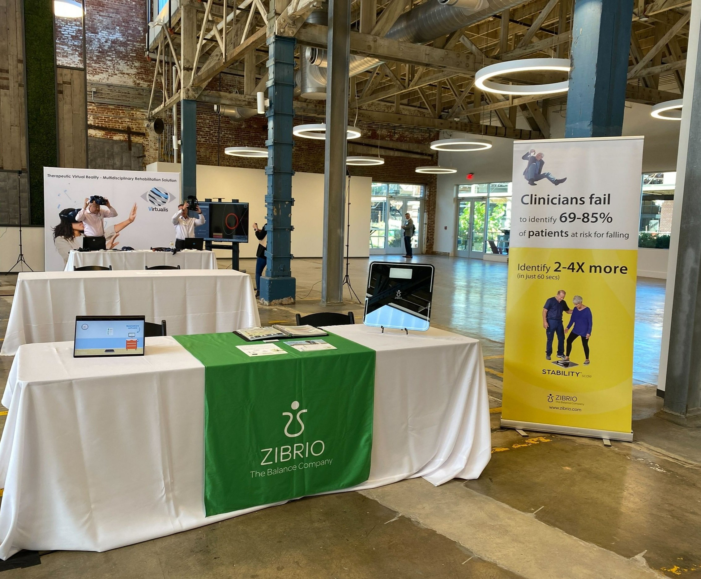
Therefore, it evolved into an expandable standing banner for Primary Care Physician - specific conferences and tradeshows, such as the ones run by the American Geriatric Society.
Outcome: The banner proves to be a high-performing banner amongst other exhibitors time and time again. It led to 15 leads at an executives conference in Miami 2022.
Secondary Printed Material
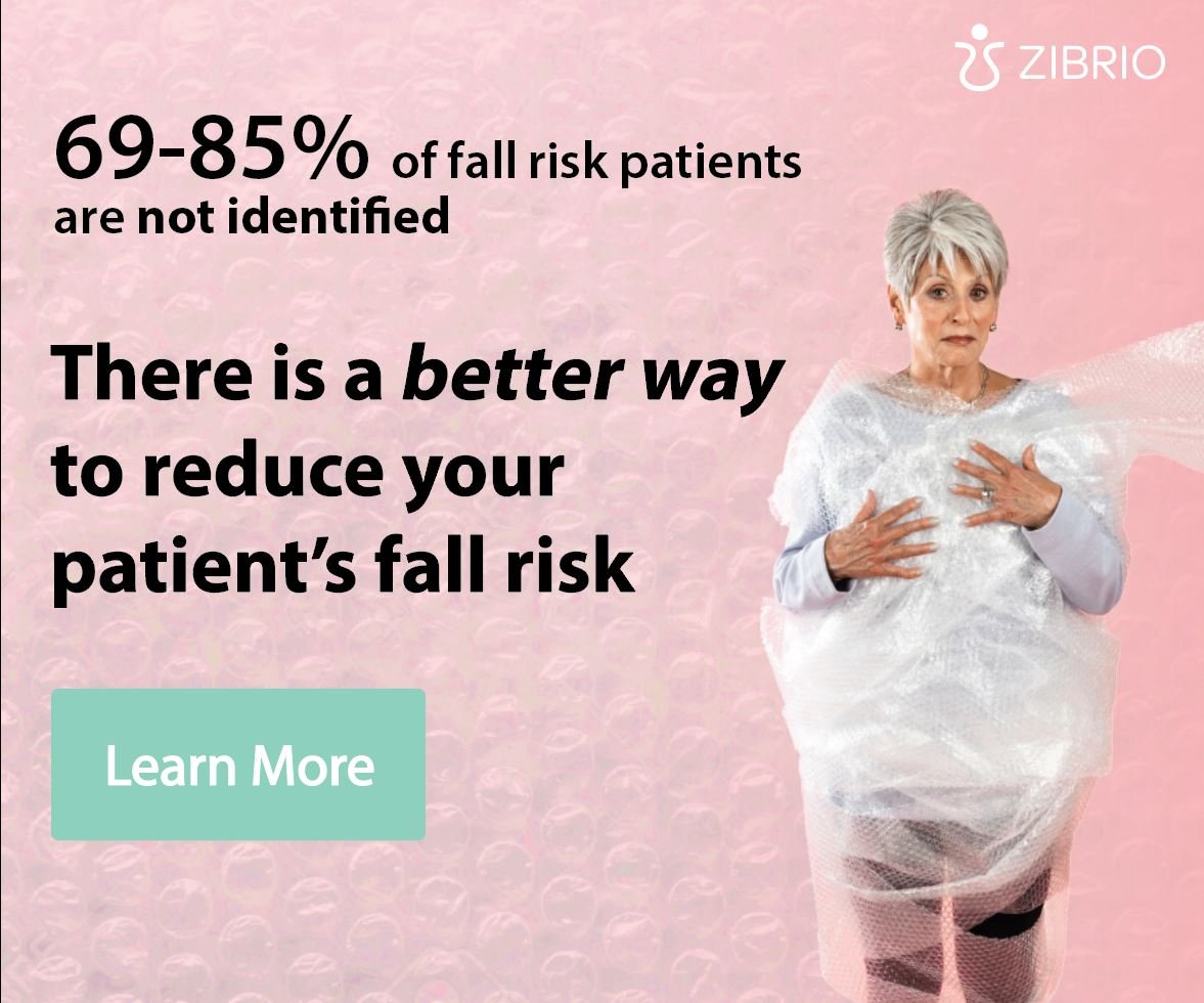
“Bubble wrap isn’t the answer to longevity”
Goal: Design humorous creative for a Facebook Digital Ad Campaign targeting the at-home consumer.
Audience: 40-90 yr olds searching these key terms online: fall prevention, healthy lifestyle
Outcome:
65,682 impressions in 4 days
I initially tested whether this concept could work for physicians as well but the bubble wrap texture on the pink was a softer - less professional look, that was more appropriate for consumers. It had a touch of whimsy which matched the humor aspect.
Nevertheless, there was still too much going on for a Facebook ad and it wasn’t quite coherent.
Process:

Final Campaign Design
